


The right font for your print
A frustration or just a bucket of inspiration: endless fonts to choose from. Beautiful decorative letters, sleek business letters, or designer letters after all? Yes, the choice is vast. So how do you make sure you choose the perfect font that suits you and your print? Find out in this blog!
What types of fonts are there, and what is their effect?
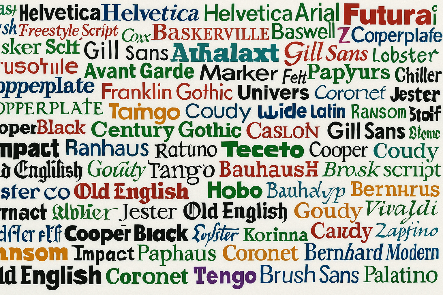
Fonts come in a variety of styles, but they can be roughly divided into four main groups. Each type has its own look and application. Below you can read which types there are and when they work well when printing on glassware or crockery.
1. Serif fonts
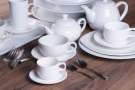
These fonts have small 'dashes' at the ends of the letters (called serifs). They look classic and stylish. Think Garamond or Georgia. Suitable for chic plates or wine glasses.
2. Sans serif fonts
Sleek, modern fonts without serifs, such as Lato or Montserrat. They are easy to read and fit on business coffee cups or professional restaurant tableware.
3. Script fonts
These are ornate, handwritten fonts such as Pacifico or Great Vibes. They give a personal or romantic look, for example, on champagne glasses for a wedding or a personalized plate.
4. Decorative fonts
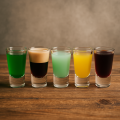
Eye-catching, playful fonts that are especially suitable for short texts or accents. Think of shot glasses with the word "Cheers!" They are less suitable for longer sentences, as they quickly look restless.
By consciously choosing a font that suits both the product and the occasion, your design will stand out much better.
Why the right font is important
A text on glassware or crockery may seem small, but the font you choose makes a big difference. It determines not only how something looks but also whether your message comes across well. Below are three reasons why choosing the right font is so important:
-
It must be easy to read
Crockery and glassware often have a small or curved surface. If you choose a thin, ornate, or complicated font, chances are that people won't be able to read it properly—especially with small sizes or light colors.
-
It should fit the purpose
A font for a wedding glass requires something completely different from one for a corporate mug or restaurant service. The font should match the occasion and target audience.
-
It should fit with other parts of the design
Is there also a logo, illustration, or border decoration on the product? Then the font should visually match that nicely. This way, everything together forms one stylish whole.
So: get to work
So take a few things into account. Is the text readable in your font? Does it fit the purpose? Does it fit with the rest of your design/logo? Based on those questions and whether you like it or not, you can make your choice. That's how you come up with a great font!
If you have any questions about this or want us to help you make a digital proof and quote for printed glassware or tableware, feel free to contact us! We will be happy to help.
Index
Popular blogs